For many of us, it’s a grind to stay mentally and physically fit. Life moves quickly and our health can easily slip away. Whether our challenge is too little exercise, fried food on the run, or general day to day stress, we all can use a partner to help us stay on track. Our client, Karla Henning - Head Coach at Whole Living in Burlington, VT, does just that.
We perform best for our clients when our minds and bodies are in tune. A healthy life is attainable, and we are convinced that the service Whole Living provides will help anyone achieve their goals.
For that reason, we were especially motivated to bring the Whole Living brand to life in a fashion that would resonate with target clients and portray a sophisticated/modern image.
We established a brand architecture to align Karla's unique services, positioned her in the market, calibrated her story, and uncovered the mandates for a fresh identity. Critical work that always comes before design.
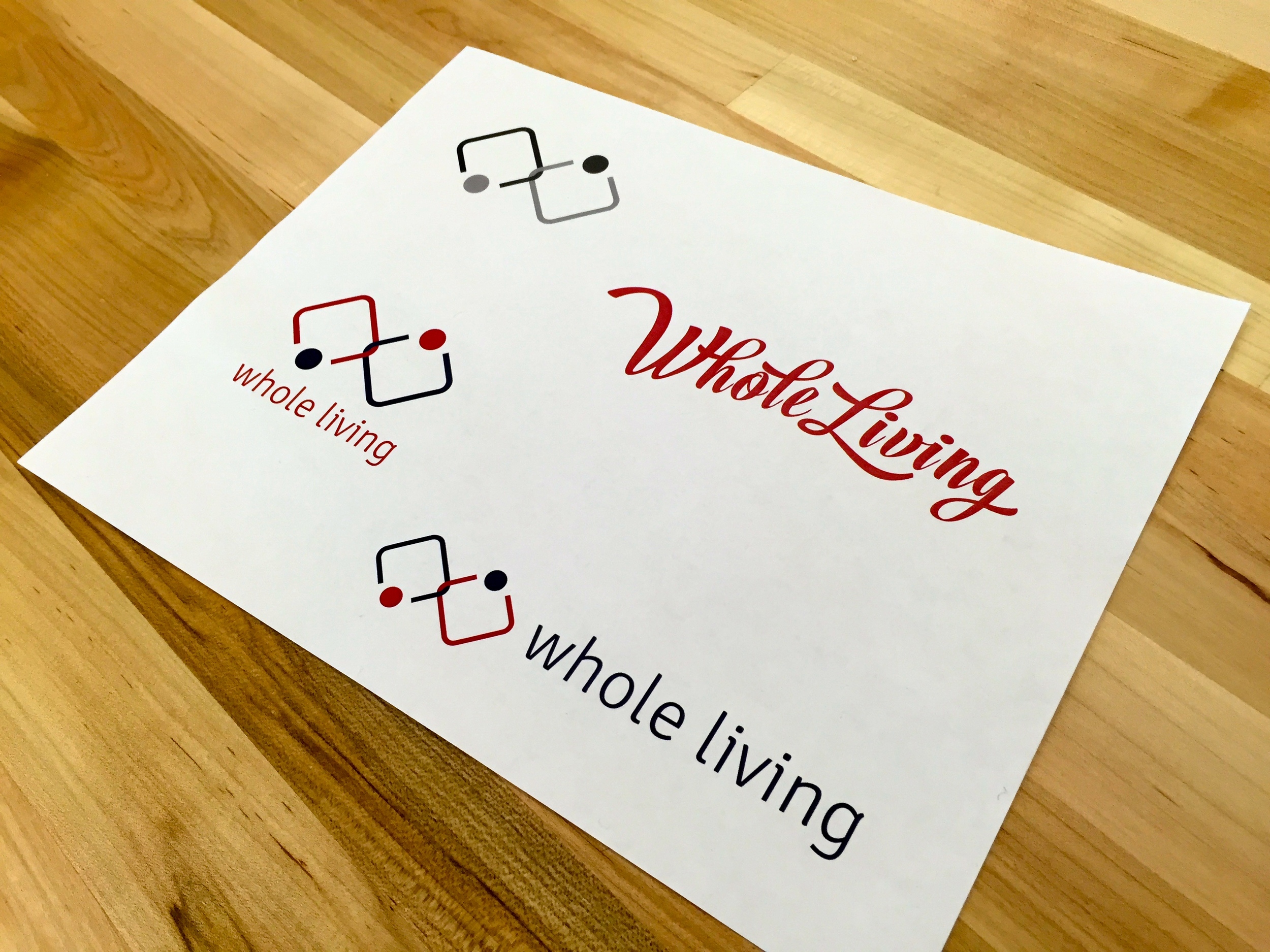
Our inspiration for the Whole Living logo came from the symbols for Infinity and Yin Yang. We ultimately developed a primary logo that we believe will stand the test of time, distinguish Whole Living in the marketplace, and subtlety communicate a few anchor points of the business.
We also arrived at a secondary logo: a script font wordmark. We see this brought to life on apparel, print materials and other alternative branding needs. It went beyond the scope of work found in the design brief, but since Karla and our team both believed it was a valuable match to her business, we were glad to include this additional art, free of charge.
Note: It’s certainly atypical for a new brand to use dual marks in the marketplace, but when done judiciously, this strategy can further distinguish the business. Alas, if you aren’t breaking the rules a bit, then you’re destined to be mediocre.
If you know a business that could use some brand refinement, please send them our way!

